I've got a site with an extensive menu that works fine in UNI. To better explain the pictures will do best.
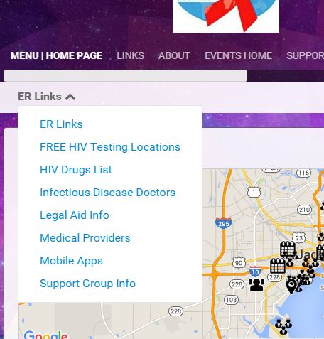
This is the UNI template showing the drop menu,
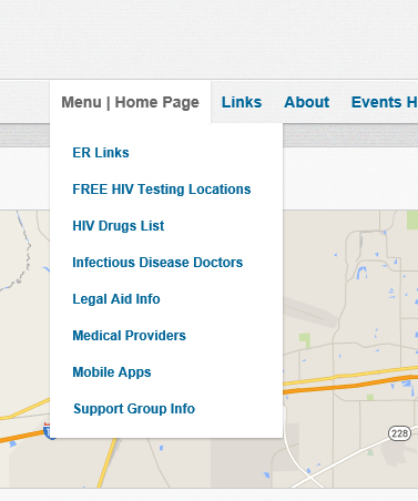
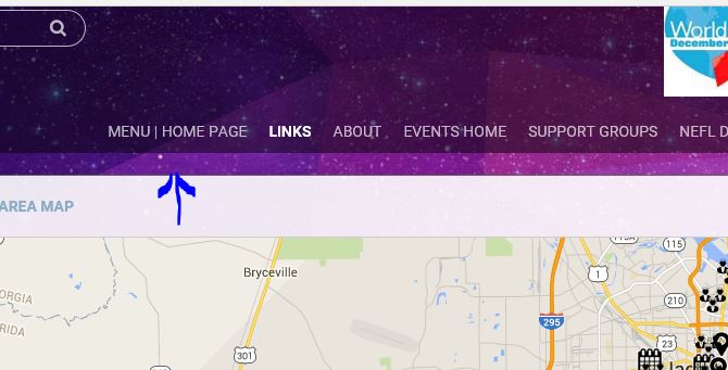
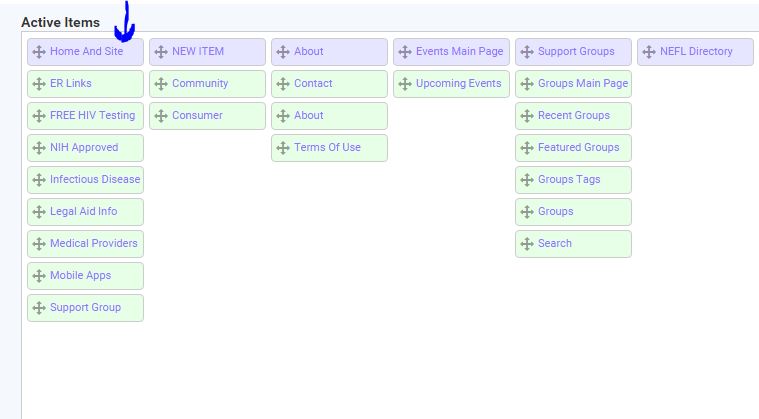
I know in the EVO template the menu is different.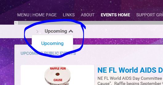
How do you design a page to show the links like the events example?
ManOfTeal.COM a Proud UNA site, six years running strong! |
If you look at the UNI template, the normal submenu area that appears under the normal nav menu which is the sys_sub_menu container does not appear on the home page. I am referring to the line of links with the icon to the left.
That is the section that is used to generate the menu your referring to on the evo template. Because that sub menu section is not generated on any page that has either BX_INDEX_PAGE or BX_JOIN_PAGE defined. As such, if your linking to either of those pages on the top nav item, then the sub menu area is not generated. https://www.deanbassett.com |
To clarify further. This is not a EVO template issue. The sys_sub_menu section is not displayed on any template on the index and join pages. The EVO template just happens to display that sys_sub_menu section as a drop down instead of a line of links as the uni template displays them. https://www.deanbassett.com |
We need a do nothing, blank pages module, that adds a parent page and some child pages, that you can build on in pages builder by adding php/html/rss blocks. Kind of a mini cms module. My opinions expressed on this site, in no way represent those of Boonex or Boonex employees. |
It is already possible to do it in page builder and navigation menu builder: add new pages in page builder, then add new items to these pages in navigation menu builder.
We need a do nothing, blank pages module, that adds a parent page and some child pages, that you can build on in pages builder by adding php/html/rss blocks. Kind of a mini cms module.
Rules → http://www.boonex.com/terms |
add new pages in page builder, then add new items to these pages in navigation menu builder.
That is what I have done for the 7.1 site. It does not work in EVO.
ManOfTeal.COM a Proud UNA site, six years running strong! |
It does not work in EVO.
If you need to display submenu on homepage in EVO template then change the following code in templates/base/scripts/BxBaseMenu.php file near ~123 line:
        //--- Submenu Menu ---//
        $sSubMenu = '';
        if(/*!defined('BX_INDEX_PAGE') &&*/ !defined('BX_JOIN_PAGE'))
            $sSubMenu = $this->genSubMenus();
Rules → http://www.boonex.com/terms |
If you need to display submenu on homepage in EVO template then change the following code
Excellent! Thanks Alex, now we can upgrade the site fully!
ManOfTeal.COM a Proud UNA site, six years running strong! |
The EVO template just happens to display that sys_sub_menu section as a drop down instead of a line of links as the uni template displays them.
Hi
I fully understand that the Evo template is the way it is but
IS there a way to display the sub menu links in a line instead of a drop down menu?
for it is not immediately obvious to everyone that you should click on the chevron to open the sub menu
Many thanks
|
I agree with @blueyhills. The sub-menu feature in Evo is far from user-friendly and there's no need to confuse our users this way. I've been using the Evo template for a few weeks and I've been tearing my hair out trying to get the sub-menus to show. It was only @blueyhills comment above that enticed me to click the chevron. That's crazy. What on earth is wrong with the scroll-over effect used in other templates such as Alt. That's what people expect and that what we should be offering them. See attached image.
Can some nice person please point me to the code I need to change to get Evo's ridiculous menu to work the same as Alt?
Thanks in advance.
|
What on earth is wrong with the scroll-over effect used in other templates such as Alt
It's called 'hover'. The EVO template is optimized to work well with tablets and phones, as well as desktops. It's rather difficult to 'hover' over a page element on a device with a touch screen and no mouse... in other words, the hover pseudo class doesn't behave well on touch screens.
In my opinion, the EVO template handles this quite nicely. When not in use, the submenu is hidden, which in many cases, only creates a bunch of clutter on the page. Tap the icon, and the menu pops up. Elegant simplicity.
OK... here's the part where I give my candid opinion and piss everybody off:
Why is it that the first instinct of everyone is to 'Dumb Down' a website to suit users that probably couldn't find their ass if it had a bell on it, or are just too lazy to look for it? What's wrong with the alternative of smartening up the users? It's not that difficult to build some help pages that instruct users on how to use the site. A navigation help page could be one of those help topics.
Navigation/menu icons like the ones used in the EVO template have been used all over the internet for a decade, and anyone that wasn't born yesterday, should have a clue.
Boonex: Leave the EVO template alone.... it's fine just the way it is.
My opinions expressed on this site, in no way represent those of Boonex or Boonex employees. |
What's wrong with the alternative of smartening up the users? It's not that difficult to build some help pages that instruct users on how to use the site. A navigation help page could be one of those help topics.
One of the first things we created was a help page with graphical help guides. Our graphic artist did a great job of creating screenshots and adding text, arrows, etc to show users exactly how to do accomplish tasks on the site. When new users join we point them to the help guides first thing to help get them started.
Geeks, making the world a better place |
For those running a site for the dumbest people on earth:
Open /templates/tmpl_evo/navigation_menu_sub_header_submenu.html for editing, Add the text in red, then save to your server.
<a class="sys_page_header_submenu" href="__link__" onclick="__onclick__">__caption__ <i class="sys-icon chevron-down">Hey - Click here and a menu will appear</i></a>
<div id="sys_ph_submenu_submenu" class="sys_ph_submenu_submenu bx-def-border bx-def-round-corners">
	<div class="sys_ph_submenu_submenu_cnt bx-def-padding-leftright bx-def-padding-sec-topbottom">
		__submenu__
	</div>
</div>
My opinions expressed on this site, in no way represent those of Boonex or Boonex employees. |
One of the first things we created was a help page with graphical help guides.
What a concept.... see if people can figure out how to do something, if all you do is tell them. I even posted a free 'Help' module that is just a clone of the Boonex articles module, for people to have a starting point in developing their own help system. If their users then need help using the help system, I'm afraid they're doomed.
My opinions expressed on this site, in no way represent those of Boonex or Boonex employees. |
Oh golly gosh!
Now let me tell you something about real people and not the nerdish users you obviously have on your site(s).
I just opened a test site and invited 30 regular posters on another group to test it. Twenty-six wrote to me and said they couldn't upload their avatar because they received an error message saying their photos were too big. I had the maximum size set for four megabytes, but they were obviously trying to upload photos larger than that for an avatar of all things. When I told them they had to reduce the size of their photos, they immediately deserted the site. All twenty-six!They all told me that they didn't know how to reduce photos and they weren't about to learn.
Getting them, or any teenager to read a help file is a joke. Unless they can navigate the site without any help they'll just walk away. Surely you must know that 90% of all computer users never read help files. No, make that 99%. I teach computers and I know.
|
I teach computers and I know
Then you should know that today's digital cameras produce files well into the MB size range, so that little problem's on you.
Since you teach computers, let me teach you something. People don't leave a website because they can't figure out how to navigate around. They leave a website because they cannot perceive a reason to stick around and figure it out.... that again, is on you. The most popular social network on the planet, has a set of icons on the right side of the top menu. One of the icons is....... wait for it..................wait for it............ something that looks like a "Chevron-down"! That blows your chevron clicking theory out of the water. I suppose Facebook could be inundated with complaints from their 1.5 billion users about that damn chevron, but I'd find that hard to believe.
Unfortunately yes, there are some really dumb people in the world that just can't seem to figure things out. You can put all sorts of effort into dumbing things down for them, to make them feel better about their lack of deductive reasoning skills, but sooner or later, after all your work, someone even dumber is going to come along and be totally confused.
You claim to be an educator, so quit complaining and do a little educating. You can't even get your students to read some instructions, and you blame it on the subject matter??
My opinions expressed on this site, in no way represent those of Boonex or Boonex employees. |
Hi Demmy
I got your message 
Many thanks |
This is a poorly designed menu interface, the fact that people are spending so much time trying to justify it's design is proof of that point. I have sent about a dozen people to a site with that theme and every last one emailed and told me the menus don't work right. These are mostly people who use their mobiles as much or more than their pc's. Most people, even the not so sharp ones, that use touch screen devices and computers a lot, know the differences between how the ui normally works on those devices. So they don't expect a touch screen menu when they are using a desktop with a mouse.
Now, for those who would argue my friends just don't get it, look at the way the overwhelming majority of responsive themes work in any other cms. They have mouse friendly menus in full screen mode and when you size the screen down for mobiles the touch friendly menus take over. Anyone espousing the misguided notion that pc users are too stupid to support because they expect a standard web ui has already proved they don't have a clue what they speak of ;)
This theme is worthless if it doesn't work intuitively for both mobile and desktop users, whether it's responsive or not. There are already several responsive themes available for purchase that work in 7.2 that have menus that work the way desktop and mobile users alike expect them to. I'll happily pay for one of those before I subject users to this theme. Besides, I have better things to do with my time than spend it explaining that, no, the menus do work, really, your just not getting it, or writing faq's to do it for me.
By the way, people do leave websites because of poorly designed navigation and hard to find content, even when they have great content on them. I've made a good living over the years redesigning them so users can navigate the site and find the content easily, and it never fails to increase site visitors, page views, and the amount of time users spend on the site per visit. Something that benefits the site owners and users alike. I guess if you can't grasp that concept you have no business running or designing websites in the first place.
|
Oh what a crock of shit bubbameister. Like I said Facebook has the exact same type of menu where you click on a chevron-down to open the menu. Go tell the FB exec that his site with 1.5 billion users is all fucked up.

Lookie there in the upper right. It's a down arrow that you click on to open a menu. wtf are those people at fb thinking?????
My opinions expressed on this site, in no way represent those of Boonex or Boonex employees. |
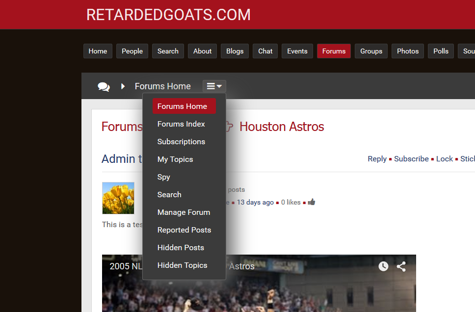
What I really meant to say, was thank you for your valuable input. I have decided to make a small change in a template that I'm working on. Instead of the down Chevron, it is similar to a menu icon used on linkedin, and similar to menu icons used in chrome and firefox. There should be some degree of familiarity. It even turns a lovely red color on hover.
My opinions expressed on this site, in no way represent those of Boonex or Boonex employees. |
Instead of the down Chevron, it is similar to a menu icon used on linkedin, and similar to menu icons used in chrome and firefox. There should be some degree of familiarity. It even turns a lovely red color on hover.
For whatever it's worth the menu icon you're referring to is called the hamburger button, and there is a UI movement to kill it, or at least minimize/optimize its use, which would fall more along the lines of displaying options along the bar as mentioned by some posters in this thread.
|
For whatever it's worth the menu icon you're referring to is called the hamburger button, and there is a UI movement to kill it, or at least minimize/optimize its use, which would fall more along the lines of displaying options along the bar as mentioned by some posters in this thread.
This particular Icon is specified in the EVO's template file:
<a class="sys_page_header_submenu" href="__link__" onclick="__onclick__">__caption__ <i class="sys-icon chevron-down"></i></a>
<div id="sys_ph_submenu_submenu" class="sys_ph_submenu_submenu bx-def-border bx-def-round-corners">
	<div class="sys_ph_submenu_submenu_cnt bx-def-padding-leftright bx-def-padding-sec-topbottom">
		__submenu__
	</div>
</div>
If you don't like whatever cheesburger icon is used change it. If you want to use text, just use some damn text in place of the icon. Use a combination of both.... whatever. Make your website look like Microsoft Bob if you want , so even brain dead chimps can use it. This is all stuff you can change in the template. Just do this FFS:
<i class="sys-icon chevron-down">More</i>
If people are then still to fucking stupid to know there's a menu there, then they're probably to damn stupid to use the internet, or a computer in the first place.
If you guys put forth as much effort into learning a little bit about how the Dolphin template system works, as you did bitching about how you don't like the EVO template, you'd be a template genius by now.
My opinions expressed on this site, in no way represent those of Boonex or Boonex employees. |
i can't make a sub menu thing at all. I make a top menu item and shove my links underneath and the whole sub menu doesn't appear. Everything is fuqed up |
i can't make a sub menu thing at all. I make a top menu item and shove my links underneath and the whole sub menu doesn't appear. Everything is fuqed up
Did you read all of the posts in this topic? The EVO template does not have a drop down menu like the UNI and ALT templates do.
Perhaps you should switch your site to use the UNI template.
https://www.deanbassett.com |
I am evaluating Dolphin (vs. Wordpress, bbPress) for a community web site. So far I love it, but I could not find a responsive template that actually works as expected. I completely reject the idea of having to deal with mobile apps to enable the content on smaller touch screens. I expect that most people will actually access the site via mobile handsets. The EVO template seemed to be wonderful until I figured that the desktop view does not work as expected (the missing 'hover' effect). What a pity. I expected that Dolphin comes with many responsive templates that are easy to customize. Just for changing the awful looking purple background I had to read forums and modify files, replacing even .jpg files.
I thought the whole idea behind Dolphin is to help folks run websites with minimum / no programming need. Yet, the very basic thing of customization is not possible without reading forums for hours. (Why can't I change the background of the EVO template from some admin menu? Or font types?)
I am very flexible with how the site will eventually look like. But I expect some good quality easily customizable responsive templates maintained by Boonex (!), because I don't want to deal with incompatibility issues at upgrades or rely on 3rd parties that may go out of business after the first release of a template.
When I read this thread I was shocked by folks proposing to create 'help' pages for people to navigate the site. I am new to web development but this just sounds like not getting the very basic principles of how to attract and retain people on the site.
So far Dolphin is on the top of my list, but I am still researching if EVO can be hacked to look as expected on desktop and mobile screens.
I am sharing this in hope that someone may take note and recognize the importance of high quality responsive templates that come with Dolphin out of the box.
|
(Why can't I change the background of the EVO template from some admin menu? Or font types?)
You can do most of the changes in the "site customizer" module, background and some fonts.
While this topic is old and showing 7.0.9, it is relevant for you.
https://www.boonex.com/forums/topic/Site-Customizer-a-new-BoonEx-module.htm
ManOfTeal.COM a Proud UNA site, six years running strong! |


