'Day Mrtn. It's getting late, but I'm pretty excited about the results thus far and I wish to thank you for raising the question and motivating me to try something different. This is actually working out to be exactly what I need because the EVO horizontal menu was getting ridiculously long. I figure that by using the method I'm using here I can have less than 9 main menu items with about 35 sub-menus (maybe a lot more). My current site has 30 menu items which is driving everyone mad.
Here's what I've done so far. It only encompasses the Profile, but it should give you some idea where I'm headed.
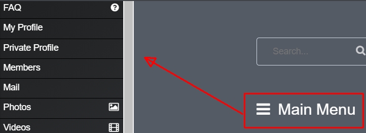
Image 1 shows Anton's Side menu pretty much as it comes out of the box. Thanks to Anton, I've added the words Main Menu next to the graphic.

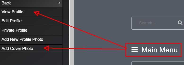
What I plan to do is place all media items under the heading of Media for example. In the case of the Profile, I've grouped all associated Profile items under that header. You may wish to add more:

These are a mixture of sub-menu items and other main menu items. For example, Private Profile is my member's account page.
With very careful planning, Main menu items and some Sub-menu items can be combined as can be seen in the example above.
It allows you to put things in some kind of meaningful order, but some links may be difficult to achieve. Everything I've done works perfectly so far and I'm taking notes which anyone is welcome to.
I still have a long way to go, but it's something worth your consideration. Please let me know what you think.
John

