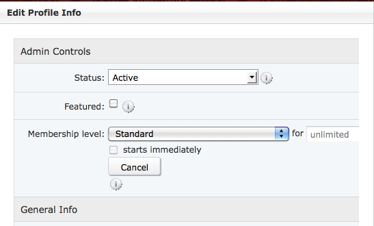
First, in the edit profile info field for admins setting up memberships, the designation for "days" is cut off (along w/ half the box):

I can adjust the size of the Profile Edit column to actually be able to see the end of this setting, but then the members have an oddly wide column w/ tiny little input boxes when they use the Profile Edit feature. I now know that this box says "days" but hate that it cuts off like that, it's sloppy and makes no sense!
Also: all of the text input fields are misaligned so that they cut off the last letter of what the user is typing: For ex:

This actually says "example of how the box cuts off" - but you can't see the last letter. While this should be fixed in the basic install, is there a way now to make all of these input boxes on my site the same size as the text entered instead of always cutting off the last letter or 2 as it scrolls the typed text?
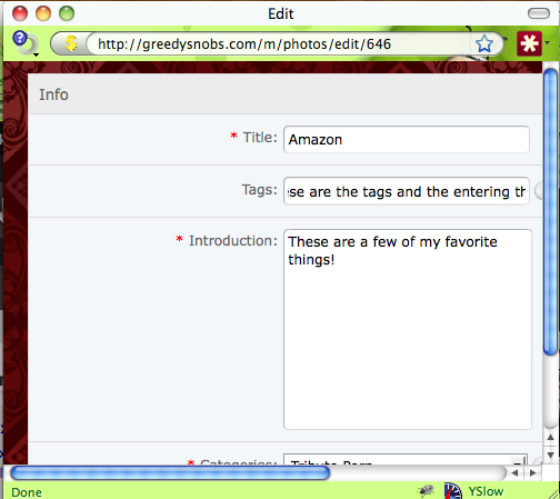
Here's another example in editing the information on a Photo upload:

This error seems to be in every single text field throughout the site.

