Your logo matters. Get it right!
Your site logo is the first thing that people see; it's the look of your community site, and it is supposed to reflect what you do. And still, all too often we see Dolphin sites with either poorly integrated or poorly designed logos. I am not even talking about the choice of style or meaning. I am talking about image quality,
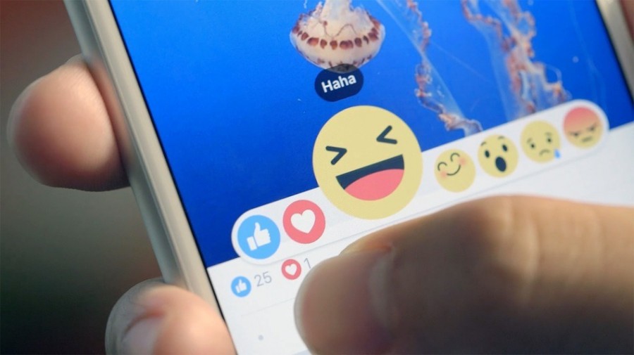
Love or Angry? Facebook Reactions are here. What about Dolphin Reactions?
The recently introduced Facebook Reactions are here to stay. It's a good thing. Quite simply they let users express they emotj-ions in a more granular, contextual way. The idea of categorised "likes" had been offered a few times for Dolphin, but has never been mainstream enough to justify development for thousands of Dolphin-based sites. Now, however, it will quickly become a
You don't need to know PHP to use DolphinPro, but if you do want to know it, here's a good way to start.
DolphinPro is a PHP platform, for the most part. It's incredible how PHP, initially created as a small "hobby' language evolved into a de-facto #1 standard for web-development. It now powers estimated 40% of all websites in the world, including Facebook. So, it would be safe to say that people browse PHP-driven pages most of the time. So, if you are
How to get the first 1000 real members to join your social network. On a shoestring budget.
Zero. That’s how many members your “community” site has right after you've completed installation, initial setup, branding and customisation. Not much of a community, eh!
The new Dolphin solution is powered by UNA Community Management System.


