The New Boonex Site

Andrew Boon posted 2nd of September 2015 in Boonex News. 18 comments.

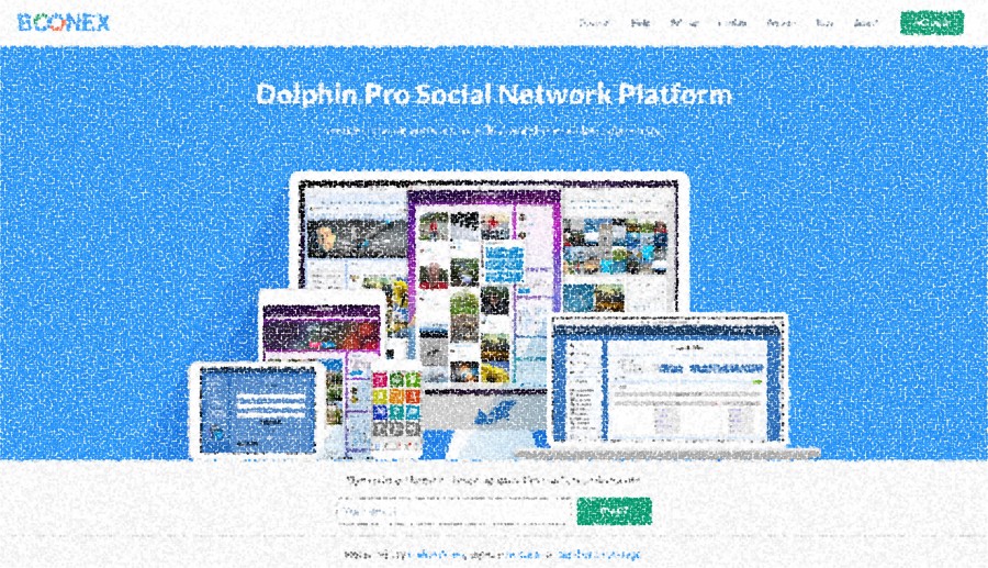
Cleaner and leaner Boonex.com is going live!


The site is updated with refreshed look, Dolphin.Pro 7.2 materials, memberships information and new licensing terms. There are a few more changes coming over the next few days, so please don't mind the slightly wacky Market and Trac. They'll look great soon!


License Pricing


You can already see the new pricing - it's very simple - free Trial with "powered by" link and $599 option to buy a license. Licensed sites will work with our Mobile Apps. So, we are opening the apps for free download - customise them, rebrand them, do what you will - as long as your sites are licensed - we're happy with you using the apps code. More details coming shortly.


Table of Ranks


Boonex Memberships and community roles are now laid out in the new Table of Ranks. We will be explaining this in detail in a few days, as soon as all memberships transition and subscription billing works are complete.


www.boonex.club


A new demo site is installed at www.boonex.club. It's not a sandbox like demo.boonex.com, where you can do anything and see it purged every 30 minutes. On www.boonex.club we created small "real" community site - just a few profiles and some media from team members. Again, we'll follow up with more details soon.


We appreciate your patience while the site is updating. It may take a few more days to stabilise it, but if something looks reeeeeeally weird - try reloading the page a few times. Thank you!

 
Recommended by
 
 
Comments
·Oldest
·Top
Please login to post a comment.
AlexT
The new boonex.com design is very beautiful !
geek_girl
The one recommendation I would like to make at this time is to do away with low contrast text, be it light grey on white, or light blue on white, or any other such combinations. Low contrast text is one of the worst things that came to the internet and it came from graphic designers that should have known better. It appears that many sites are moving away from low contrast but way too many sites still make this bad mistake; don't let Boonex be one of them.
Andrew Boon
Thank you! Would you point out which texts do you feel have low contrast?
moonsoon2u
Responsiveness issues. Unfortunately I can't share them due to sensitivity of my account details. Key & secret still mentioning dolphin u o.O It would be nice if members details shown in top instead of product.
IRATE
I like! Do not load the new profile photo, avatar.
jmonroe
It does look nice..although, the font is a little big on the forum index page where it states how many posts/replies.
Expertzkris
Nice i like this but I cannot edit my profile description to fit new boonex template color scheme.. if you can bring it back would be nice.
deaftv
Boonex is very good!! Dolphin.pro is very beautiful!! :-)
Rappi
Do you have any vision problems or are you blind?
The graphics in the market, the font is everywhere much too big!
The new layout is terrible.
bellhophil
First of all... The new site looks great! Very nice work!

Second... In the market the list choice (latest, updated etc.) doesn't get "saved" for your next visit. On the old site it was and it was really nice. I had it always on updated, so every day when I visited I saw really fast and easy what modules got updated. Maybe a nice addition for the new site?
Andrew Boon
Interestingly, on the other hand we had complaints when people couldn't find items, forgetting about selections they made before. I guess it's best to make "remembering" optional.

Anyway, this browsing/filtering will be further improving shortly.
The new look is clean. Cant please everyone.
hd4real
The Boonex site has an accessibility problem. The onscreen keyboard can not be used with the text editor. This is everywhere the text editor is enabled. I have to check Dolphin Pro to see if this is also the case.
Andrew Boon
It's only Boonex problem. We still have old text editor here. Mostly we focus on Dolphin, so a lot of things here on Boonex have to wait.
Simion
Looks great... BUT.. Where did the jobs section go?
Andrew Boon
It gone for now. We'll be updating and bringing it back later. For now Forums can be used for job offers.
 
 
Below is the legacy version of the Boonex site, maintained for Dolphin.Pro 7.x support.
The new Dolphin solution is powered by UNA Community Management System.
PET:0.063833951950073