Dolphin PRO Responsive Design Prototype
Work on Dolphin PRO is resuming alongside with Dolphin U development. As we've announced earlier among other things Dolphin PRO will be getting a responsive design overhaul. There are many ways to make website interface "responsive", though. In Dolphin U, for example, we are experimenting with more unconventional, but compact main menu and adaptive popups, while pages content relies on either masonry grids or adaptive resizing. Dolphin PRO is a different beast, however. Menus are multi-level and there're so many various content types that no one trick can tackle it all.
"Clear" Design Language
Clear - "easy to perceive, understand, or interpret" ; "free of any obstructions or unwanted objects".
We've been exploring different options, putting together different sketches and testing various solutions. We start off with what a "Clear" principle - what doesn't have to be there, mustn't be there. Thus, we should do away with unnecessary shadows borders, textures, gradients, etc. More importantly, we should remove any cognitive load where it's not helping the end-user. Links and menus should only show when necessary; options presented only if needed; meta information minimised, etc.
For easiness of perception, we should look for removing any unnecessary action steps; abridge text explanations; simplify forms. UI design decisions should rely on recognisable conventions that make interaction with a site as intuitive as possible.
And, naturally, we should seek for the design to be absolutely mobile-friendly. So, again, testing on mobiles and tablets first, and then adjusting for desktop.
First Prototype
Today we'd like to show you what we believe is going to be a very close approximation of Dolphin PRO visual design. Let's take the homepage with basic elements...

This is a "desktop" view. So you can see extra elements like search box and notifications icon in top menu. In mobile view they would hide into side menu and member-menu.
Other elements, like buttons and blocks are as simple as possible. Splash screen is a classic "template" for just about any type of community site intro.
Now, let's take a look at the main menu...

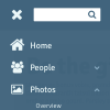
Since Dolphin PRO has so many modules with multi-level menus we decided to opt for vertical side menu that also incorporates site search. This method has become reasonably conventional, so we may expect users to grasp the idea quickly. Most mobile versions of social networks, online newspapers and web stores use some form of slide-out side menu now.
Side menus can work in many different ways as well. They may "push" the whole site or overlap (like in our example). They may also appear static when there's enough screen space. At this stage we believe that simple overlap is the most straightforward way, but live testing may bring more ideas.
Walking The Walk
Despite ongoing development of Dolphin U we decided to ramp up active development of Dolphin PRO now (by popular demand). In part this is because Dolphin U development process often births ideas that just should be implemented in Dolphin PRO. And if not done right away, they may be easily forgotten or overlooked.
Actual release or even Beta versions are still months away (think Spring 2015), but SVN is always there for enquiring minds. We will also keep you updated, even during planning/prototyping stages like we do now. Times and times again we see how community input (especially on early stages) navigates us towards the right direction. So, do let us know what you think, please!


Example:
Bacon ipsum dolor amet turkey ribeye beef, pork belly bresaola sausage tenderloin venison chicken pig brisket picanha meatball shoulder tail. Brisket corned beef bresaola pastrami frankfurter tri-tip ham t-bone. Andouille biltong porchetta turkey. Meatloaf cow strip steak brisket salami tri-tip.
Tenderloin tail pork belly, short loin bacon pork tri-tip swine. Shank sirloin brisket salami, rump pig strip steak cow pork see more
Check this website http://tune.pk/ it have same vertical menu but when you click it also switch the whole webpage by making the menu bar static but the rest of the page dynamic.
and plz don't remove the vertical menu..put this as an option for other who want to use horizontal menu..
therefore will have the next dolphin in 2016
over 2 years to get an update?
You may have heard of those new fan-dangle things called mobile phones. Apparently they are all the rage. Now if only chat rooms could be used on those? Hell, what am I saying?
I would be happy if Boonex got responsive and actually responded just the once to this issue instead sticking their head in the sand.
Will this "Clear" template be an addition in 7.2 or makeover?
Spring 2015 as in northern hemisphere March or southern hemisphere September?
I've just started working on ours and am about to spend some real $$$ on a number of functional customizations that appear to already be in your pipeline (or maybe even done already). To know that the updated apps should be ready around X and will include Y features would be very helpful.
Thanks for understanding and, in advance, for a real answer.
I like vertical Menu
Chat, Video Record, Messenger, all without Flash ?
i like not Flash
B) I would also love if you could make all the built-in/standard/core + any custom blocks available to all pages in Page Builder. This is what I miss the most - I would like to build at custom page and be able to include see more
Before windows we used batch (*.bat) files. How many remember those as your main menu system?
-------------------------------------------------------------------------------------------------------------------------------------------
I see more