Dolphin Pro 7.2 Admin Facelift

Andrew Boon posted 12th of June 2015 in Dolphin.pro News. 47 comments.

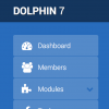
Administration panel of the upcoming 7.2 release has received a refreshed design. We are now going through little bits and pieces, but you can already see the general idea. Mostly it's a switch to non-bitmap design elements (retina support), but while we're testing it out we're also adding small fixes and improvements, like "quick links" in dashboard, new library for charts, improved builder, etc.  


One important benefit of the new look is that you can change background colour, or use your company-styled background image. Here's a manly pink variant :) ...


More is coming... stay tuned!

 
Recommended by
 
 
Comments
·Oldest
·Top
Please login to post a comment.
Andrew Boon
Never mind that it says 7.1 in screenshots. Development version numbering doesn't change until we produce an official release.
Prashank25
That dolphin logo with the last item of that menu is too much attention grabbing, did not like it. Maybe its just me :|
Andrew Boon
It'll go away once a license is registered.
shymatsi
It's flashy, I actually like it lol
EagleII
Yep... It appears polite and I never heard it say a thing. Must be you! (G)
EagleII
Classy admin area....
Question: I have been working on a community site and hope as it goes commercial and thus raise the revenue to license. The question is: Can the license be attached to the Domain vs a Person? People move in and out of neighborhoods, and some like I, ( over 67 years on the planet ) walk on to a new adventure via the grave..
How would that work? The site ( - with front page sarcasm of the present regime no one cares for ) is still being tweaked... but it appears it see more will be a go at some point in the near future. http://www.myneighbors.net
- it will be owned by My Neighbors Network a soon to be LLC - so would the license go to the "name" or the "domain"? ps: I get wordy after sipping my Geritol Liquid High Potency Vitamin & Iron Supplement, with Ferrex Tonic. (G)
EagleII
ps: rather than having to tweak the WYSIWYG editor outside of Dolphin, can a control area ( like Drupal's maybe ) be implemented in Admin so one can set or unset options / based on access level. I like a full blown Editor for Old Dummies like me ..but would prefer to limit user options based on access level/trust.

I'd go for it, but I build more bugs in the code -- then not -- these days.... Probiotic Diet hasn't helped.
Andrew Boon
License is registered to a domain (which you can change) and issues to your BoonEx account (which you can pass over).
EagleII
Sounds easy enough. Assuming arguendo: We could open an account at the point in time in the LLC's name, that can be passed as leadership changes without any ado. Would that work?
Andrew Boon
Sure. That's not a problem. To us it's just a username/email/password - you take care of who it actually is/will be. :) Though, it's be good to see you sticking around for a good while longer. ;)
houstonlively
Andrew, you haven't fed the animals for 10 days now. Hungry animals can get very testy.

So what's new? What are you going to do about those awful flash apps?
houstonlively
Yeah.. new uploader is good, but I want client side image resizing.
moonsoon2u
First main priority is responsiveness. That is still a work in progress.
houstonlively
Responsiveness is just a buzzword everyone has latched onto. Responsiveness is mainly for little weenies with cell phone that their mommy bought for them. None of them have real jobs and can't afford a real computer, so all the rest of us have to work at our day jobs to make the little weenies happy. First main priority? Says who? Not me. I can think of at least two dozen other things higher up on the list. Did you see my comment about flash apps?
moonsoon2u
Yes I did see your comment about flash apps. Those kidz are the source revenue for websites. And 80% use cell phones to access social networking websites. So main priority is responsiveness cause dolphin is a social networking software unlike a business one. No hard feelings :p
houstonlively
What you meant to say was 80% of those kids use their cell phones to access Facebook, and then it's via the Facebook mobile app. It's a meaningless statistic as far as "Responsive" Dolphin sites are concerned.
there is no such (good) app in D. so responsiveness - is the point.
houstonlively
It depends on how you look at it. If a person can't access a Dolphin site via a cell phone app, they are not likely to get very involved with that site by accessing it via a cell phone web browser. Everybody likes to talk about the high percentage of users that access websites via a mobile phone. For the most part, that means Facebook. I seriously doubt that a very high percentage use the cell phones web browser to interact with FB... the last time I checked, it was an extremely annoying experience. see more Mobile apps can interact with the cell phone file system more efficiently than web browsers ever will. Until the Dolphin mobile app takes on a lot more sophistication and polish, cell phone users aren't going to think much of your sites usability, and all you "responsive" experts are pissing into the wind.
With all due respect, I'm neither "responsive", nor "expert". Moreover, I prefer to piss in dedicated directions. So, I understand that Your "you" not addressed to me.
I'm trying to run small closed social network and from 300 users I received 400 complains that they want to access it from cellphone. May be they are fool and know nothing about how good site (not for idiots - in Your words) must be operated, but they know very well how they want to use it : immediately, see more tens times per day, in bus, in park, in bank or store - get news, comments, updates etc. "Responsive" layouts doing it badly, D/app - worse. So, for me, in current time, in today's conditions - Resp is the solution. Yep, partially, temporary, poor and ugly. Btw, do You know better one?
houstonlively
I just know what I'm going to do on my own sites, and that's to switch to an entirely different template when any cell phone user agent is detected. I never liked the idea of a desktop PC user with a 24" monitor, limited to seeing only that which can be seen on a tiny cell phone screen. It's only my opinion, but to me, that is utterly stupid.
Here I must agree. It will be nice to switch between different templates with same color&design palettes and css edited layout to minimize mobile one. I'll buy switching mod. Inform me, please if You mind to put it in market.
TravelNotes
They're only source revenue for their phone providers.
TravelNotes
The only person I know to say it like it is; apart from me.
Andrew Boon
The new photo uploader does client-side image resizing and auto-rotation.
moonsoon2u
I tried the admin area in my offline demo version. Seriously it was giving me headache But good thing we can change it :p
paansystems
I dont really care much about a design of an admin area, i would love to see some cli based admin panel
paansystems
but hey, maybe you do some under the hood improvements too not just UI related things ;)
mrtn
Dear Andrew

Tell us more. Also about 7.3 and 7.4.

For instance, will we have the possibility to use this "sidemenu" with the error icon, which we can see at http://demo.boonex.com/

Thanks
Andrew Boon
7.3 and 7.4 are planned to be follow-up updates that should introduce new chat, improved messenger, friend-finder, further improvements in responsive layout, timeline and other modules in mobile apps, new licensing, etc.

The sidemenu that you've mentioned is for demo site guidance purposes. Why would you need something like that on a site itself? Or do you mean navigation menu realised that way?
mrtn
Yes, it could be navigation or whatever. Why not have in the regular version. Can you tell us about the time scheme for 7.3 and 7.4. When should those be released?
TravelNotes
Don't like the side menu on the demo. Please keep it off our main sites!

Also, why do objects in the timeline slide in from the left and is there a way to turn it off?
dolphin_jay
7.3 7.4 really that's 4 plus years away. Why would you even ask about that ....
Eli
Please Search bar as in Trident if possible :) Thank you
namesbuying
Good idea! Responsive ?
EagleII
Happy Fathers Day to Dads who may make the trip here..

suggestion for the user GUI in future 7.+ or 8. - Leaving the fixed amount of photo's as an option to be shown ( where ever one wants ) most oft on the front page, or have an added option for ( I noted you play with lightbox vs shadowbox ) rotating images that one can click and have the image popup in a lightbox or shadowbox container and turn into a slide show. I added a rotator at: http://www.myneighbors.net front page - and had a shadowbox see more call with height/width and it worked well..but that is not integrated into admin. The rotator is still up, but I linked it to the actual image it shows so the text about the image could be read.

I also noted my problems with 7.1.6 were just that, my induced problems.. so disregard my gray bearded chatter about any issues I may have mentioned.

Joe
Still dumb after 67 years on the planet
mrtn
Is it only me? I do think that we need in the admin section a SEARCH for usernames.

And by the way.... When will 7.2 be released?
moonsoon2u
click on members>search in admin panel..its on right side
houstonlively
7.2 will be released sometime between the day before it is released, and the day after it is released.
geek_girl
It is a good thing we can tweet the design because those round icons of members has got to go!
mrtn
I would like to have hexagonal, like in Battlestar Galactica.
deaftv
Dolphin 7.2
Chat, Messenger, Boards without Flash???
Video with Subtitles ???
Andrew Boon
7.2 already back a whole lot of improvements, but there will also be 7.3 and 7.4 following shortly after.
How do I download this upgrade? my admin panel has msql error
 
 
Below is the legacy version of the Boonex site, maintained for Dolphin.Pro 7.x support.
The new Dolphin solution is powered by UNA Community Management System.
PET:0.090333938598633