Dolphin 7.2 Development Progress Update

Andrew Boon posted 5th of May 2015 in Dolphin.pro News. 61 comments.

Next major version of our flagship product - Dolphin Pro 7.2 - is under active development again. We can already see that the process is vastly different from the way we did it before. Improvements and fixes are not just progressing from 7.1, they also stem from Trident (our resident lab rat).


There is no Beta or Alpha version available yet (although our "continuous integration" practice means that current SVN version is functional), but that time is not too far off. We will work though these tickets during coming few weeks and will produce the first Alpha then. Some of the planned improvements are already in, and some are to be added during Alpha-testing.


Yeah! Big-boys league season is on again!    


Now let's sneak a peek...


Perhaps the most ambitious ideas in 7.2 is making it mobile-friendly. Optimisation for small screens involves meticulous adjustment of every UI element, which in turn results not only in "responsive" template, but in a better overall experience. Big changes like that may inadvertently break things, so we chose to create an additional pre-packaged template, which would carry most of the changes. The new template is called EVO


Along with responsive layout EVO is built to be very flexible. We are using mostly neutral colors and a lot of transparency, in a bid to create an "overlay" that would work with any site background, or background used by members via Profile Customiser. This way, you can create unique look and feel simply by changing the site logo, editing texts and uploading your background image. There will be a "Site Customiser" module to do that without messing with any code. 


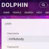
Here's an example of the new cleaner login form on a smartphone screen - showing the new forms layout, responsive block, sliding main menu and background+transparency look...


And here's an example of a "desktop" view, with join form. Again, showing cleaner forms and how quick swap of background image completely changes the site look and feel... 


We are now in the midst of the creative process as well as routine bug-fixing toil, so any feedback is welcome, constructive particularly. Just don't make judgements yet - it's still raw as. 


And with this we are starting regular updates on Dolphin Pro 7.2 development process! We'd like to share and chat about even small adds, because this is how things get due attention and we can get them right, together. Stay tuned!


Recommended by
 
 
Comments
·Oldest
·Top
Please login to post a comment.
IRATE
We believe, we are waiting!
areavis
It looks amazing. Can we expect release in May / June?
Andrew Boon
Upgradable Alphas, yes. Beyond that, it's hard to know.
Eli
for example am using 7.1 , is there will be an easy upgrade to 7.2 ?
Andrew Boon
Yes, this will be a standard upgrade with upgrade script. We don't expect any serious complications.
EagleII
Never a dull moment! If it weren't for bugs you'd never know you had any live users. Great work..
Joe - Over 67 years on the planet and still squashing "byte" bugs...
namesbuying
Very critical upgrade!
kinuthia
Great work. I'm happy that you are taking the mobile aspect very seriously.

I have always wanted to ask about the "posts age" (of all types). It is always in days but my feeling or what i would prefer is the actual post date after 24 hours.
gsicard
I agree with this. Much needed change
DeanMonte
Nice mobile looks different.
gsicard
Good work Boonex. Is there a chance of stripping out the "dating" features from this release?
mayzfieldtv
Dating is still in style though. Maybe they can just make it "dating optional". Click a button to show/hide dating features. Plenty of Fish still makes a lot of money.
gsicard
Since dating is purged from Trident it should also be removed from Dolphin.
houstonlively
One of the most brilliant suggestions I have ever heard. It's a real pain in the ass to remove all those stupid matchmaking and dating fields every time you do a fresh install. At the very least, all the dating crap should be added/removed via a module or some sort of extension.
houstonlively
Sure dating is in style, but do we really need 700,000 Dolphin based dating sites? There are two dating sites in the world: match.com and eharmony.com. Everything else is irrelevant. No normal person would want to join some creepy Dolphin based "Dating" site run by some unknown creepy individual.
EagleII
Have you seen your profile pic? I can see why you'd have that mind set. LMAO
houstonlively
That profile pic is a result of me removing my original, actual photo, and changing all my domain names to private registration, because of several creepy individuals on THIS SITE, having psychotic episodes. There are more mentally disturbed people on this site than you can imagine. I rest my case.
mscott
If I had to venture a guess I would say about 70% of them..
Andrew Boon
Yes, we are removing built-in dating features completely. Dating is important, but should come from Extensions.
jmonroe
I agree with the above. Dating should be a module by itself. Dolphin should only remain as a social networking platform.
EagleII
I guess dating can be "anti-social". Hmmmm an off shoot venture for Andrew.. Dolphin "Shark" The Anti-Social Platform for lovers.
Come here my sweet, let me "BYTE" you ..
( Yes I found my Geritol )
Joe, Over 67 years on the planet and still having fun.
EagleII
"Dating is important, but should come from Extensions." -- I could have fun with that.
EagleII
you can do that on your own.. it's an option ( unless I am seeing the tic boxes )
http://www.myneighbors.net ( the free version of 7.1 ) - a work in progress.
Joe - Over 67 years on the planet
Seems weird to call something EVO when there is already the EVO Wall and the mobile version of the EVO Wall that is a big selling module. Unless this was worked out with that team already.
ilbellodelweb
No, Boonex choosed this name but there is no relation with us and with our products
Andrew Boon
This template is packaged with Dolphin and won't be marketed as a separate product. So, there won't be much exposure for the name. I hope ilbellidelweb won't mind.
ilbellodelweb
no problem. I just hope not to have to explain that my products are compatible with all templates and not just with the template EVO
moonsoon2u
In this alpha there going to responsive changes only? By any chance inclusion of internal sharing feature? Details of step by step upgrade would be nice. It will give us a road map of what to expect in future.
Andrew Boon
There are over 100 tickets that will make it into 7.2. Mobile-friendly template is just one of them.
launch3
Two constructive fixes:

1 - when members share links with their friends on social networks, websites or via email - visitors (non-members) get the dreaded, unchangeable "access denied" or "access is forbidden" pages. Each module has it's own lang file for this too making it worse. Please fix to allow a single, customizable page where I can add persuasive ad copy like "hey, to see this great video, photo or article - join fast & free today!". Converting non-members see more to members is #1.

2 - Embedding videos, photos, audios, etc. Every website WANTS visitors to embed or share their content. Yet, in the video module for example, only youtube is allowed to embed. Even with the 3rd party module added, there are still a TON of websites that members cannot use embed code. Extremely frustrating. Furthermore, pasting embed code into a member's "timeline" to share with friends only shows the embed code, not the content desired = very unhappy members.

Looking forward to 7.2. Thanks!
trunky
absolutely agreed to first point
launch3
Two more fixes, related to searching:

3 - the 'Search' functionality is awful at returning relevant results. In addition to updating this to make it useful again, please include a Search Results page to allow customization in Page Builder. I'd like to be able to include ads/banners/links around the organic results.

4 - Google Site Search mod is outdated. It does not function with the many new standards and features of Google. For instance, I cannot incorporate 'Adsense For Search' custom search see more engine. It's a nice revenue generator on my other websites.

The ability for the admin to select which search results to display (dolphin or google) when members type anything in the standard on-page search box would be helpful.

Visitors and members NEED the ability to successfully search our websites (and not get frustrated).
Andrew Boon
Thank you! Good specific suggestions.
IRATE
What prevents to make their Google search page with Adsense? It took me 10 minutes of time.
AlexT
1. We have different approach in Trident, which is similar to what you suggested - there is more informative message about action which can't be performed. At some stage we maybe merge these change into 7.x branch.

2. Thank you, we will consider this.

3. Search is more flexible in Trident, at some stage we maybe merge these change into 7.x branch.

4. The fix is coming - http://www.boonex.com/trac/dolphin/ticket/3345
launch3
Thanks for the responses Andrew & Alex! My members biggest beef is the lack of ability to conveniently share and embed content (videos, images, etc...) from THEIR favorite websites (fix #2 above). Dolphin is, after all, a social network / community. It's all about sharing these days! For instance, I have quite a few experts in my niches who I got to join my sites for the purpose of sharing/embedding their best website content onto mine and interacting with members without having to leave my site see more (so my site looks like the authority in the niche). Unfortunately, it so severely lacking in this area - even with 3rd party mods installed to help make it better. I hope 7.2 improves greatly in this area. Thanks for listening.
faceclub
Will it work on the Windows Phone Platform?
trunky
mobile means responsive from what I understand, so it adjust to the screensize. It's not a native app for iOS, Android, Windows, whatever. You'll still need just your browser :)
mayzfieldtv
I want it now, please. I am going to wait until this is ready.
jmonroe
Great news. I think Boonex is headed in the right direction.
mayzfieldtv
I honestly think this new version of Dolphin Pro is going to make me rich. I am moving to Tokyo. Is the video chat going to be compatible with Androids, iPhones, etc? If it's going to be viewed on mobile, everything has to also "work" on mobile. Video chat is important like Skype and FaceTime.
Casal Pimenta
attention to the payment module
paypal and check out do not work with adult site
I am in Brazil, many companies do it here
but changing payments for them?
payment module could be editable?
we need a solution to this !!
Nathan Paton
You can already add different payment providers to Dolphin. By default, PayPal and 2Checkout are included. One that supports adult sites is (according to their terms): http://www.boonex.com/m/payza-alertpay-payment-provider
onesimus
I'm very much excited for this phenomenal upgrade. Congratulations to BooNex team. God bless and more power.
ilbellodelweb
We hope you will add the feature "Add Row" in the builder. It's a feature much required.
Andrew Boon
Please, elaborate. What do you mean by "Row"? In Pages Builder?
ilbellodelweb
As you know you can create a new column and add a new block but it's not possible to create a new row. Often members want to create a row with only a column and another one whit 2, 3 or more columns.
Andrew Boon
Ah, got it. "Row" as well as that we have "Add Column" is Page Builder. We did this differently in Trident (via Layouts), but would consider what can be done in 7.2. Thanks!
ilbellodelweb
This request had been accepted for the development of d7.1.3 ( if I remember correctly ) . But I see that at the time was delayed ( d7.3 ). These links can help:
http://www.boonex.com/trac/dolphin/ticket/3104
http://www.boonex.com/forums/topic/Add-Row-for-Page-Builder.htm
moonsoon2u
But layouts are limited in Trident. I think there is a module for row in dolphin.
dictofdreams
I have one request !!!
Modern, professional, very functional messenger ... please :)
Nathan Paton
Ah, I love full-width form items...

And I think this kind of responsive menu is better than the one in Trident. Can't wait to try out the end result.
Andrew Boon
Trident menu is practically the same. It's just hidden by default.
Eli
Is it possible please to add option of Location as in trident , or maybe better .
EagleII
I have been using shadowbox on a test basis at the site I am playing with. To include it sitewide for images, video's or certain links would be an interesting addition. I may do it before I die to what ever site sandbox I am playing in.. but thought, hell, why not bug Andrew to add a tic box available on images, links or the like as an option. After all I am using the free version, why pay with hunt, peck, error, and time? (G)

For most links you only need this in the a href area: rel="shadowbox" see more title="your title" or
rel="shadowbox[mixed];"

You can view source to see the small amount of code that is added in the header area that make it all work.
(*.js & *.css call) http://www.myneighbors.net

My 2 Cents..

Joe over 67 years on the planet and still creating bug bytes
daihlo
iphone friendly (non flash) chat module please :-)
planetseeder
I want left menu! Top menu are old school and it really looks amateur!
planetseeder
I would like to have a menu builder for have left menu on the front-end. I really dont like pages that has to much menu functions on top. Left menu is really a must to bring professionalism to a site and the left menus on the boonex marked really is anything else than professional.
 
 
Below is the legacy version of the Boonex site, maintained for Dolphin.Pro 7.x support.
The new Dolphin solution is powered by UNA Community Management System.
PET:0.11990094184875